Brand Refresh & Product Return Launch
An inspired design refresh for a beloved cider and a dark return launch that grabbed the attention of our audience months before launch and continues to drive sales to this day.
Strategy Snapshot
-
Reintroduce a cult-favorite cider with stronger shelf presence
It wasn’t that this package didn’t already have presence, if anything it’s original aura is what got it so much attention. The objective was shelf presence that captivated more customers, cult-followers and flavor enthusiasts.
-
Craft beverage drinkers seeking bold, premium flavor
-
Strong Product loyalty, but weak shelf communication
We realized pretty quickly that cider is not the number one choice for most alcohol drinkers, it’s more likely an alternative due to allergies or dislike for beer. Cider can’t get away with names and packaging that don’t convey flavor immediately the same way that craft beer does. So why not boost the brand that has great liquid and high impact visuals by improving the flavor communication.
-
Evolve the dark brand identity while amplifying flavor cues
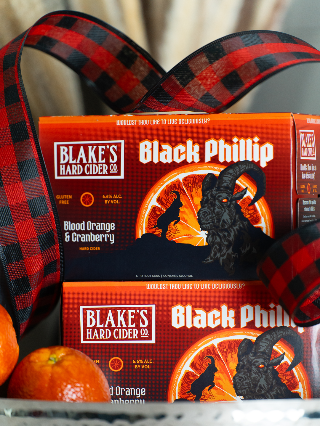
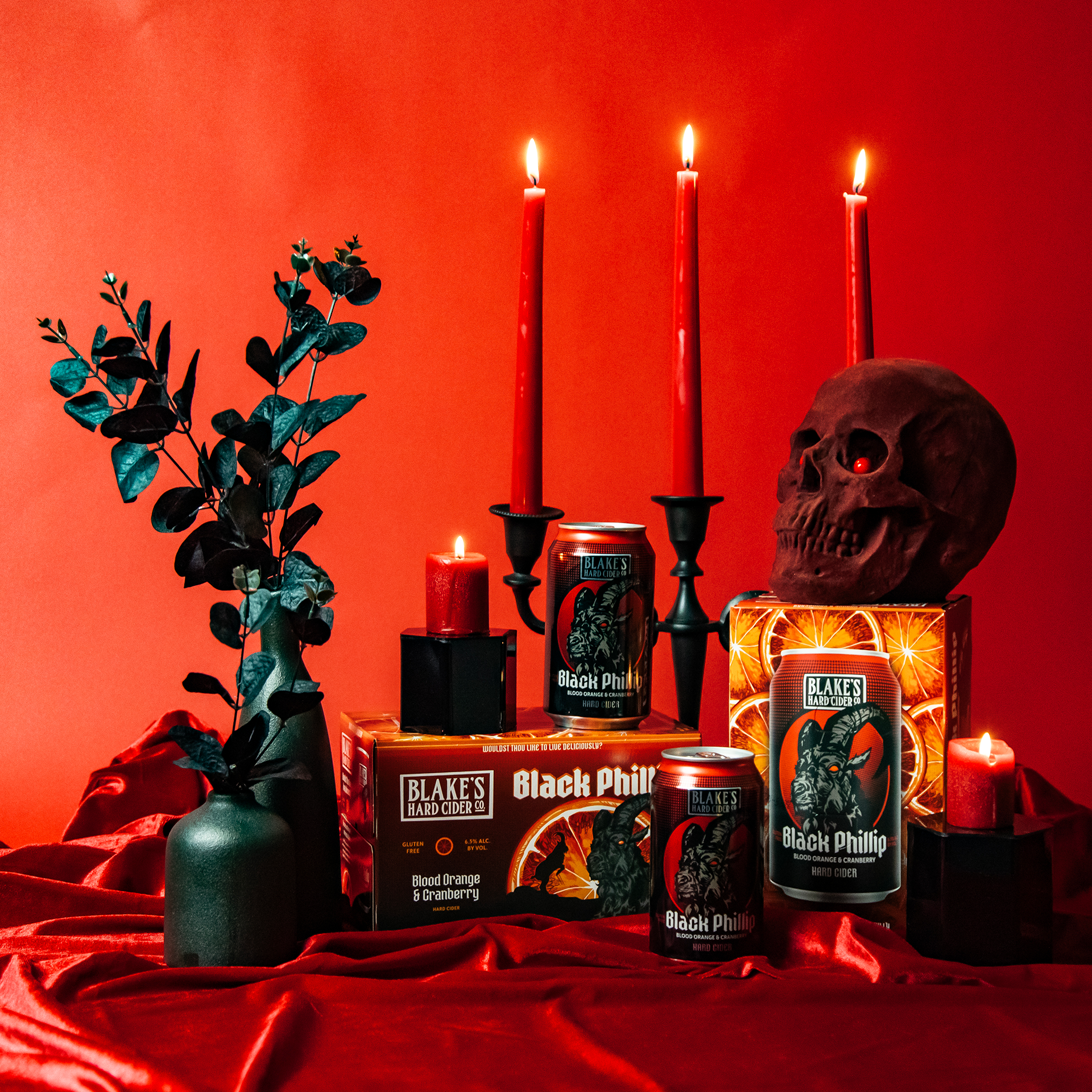
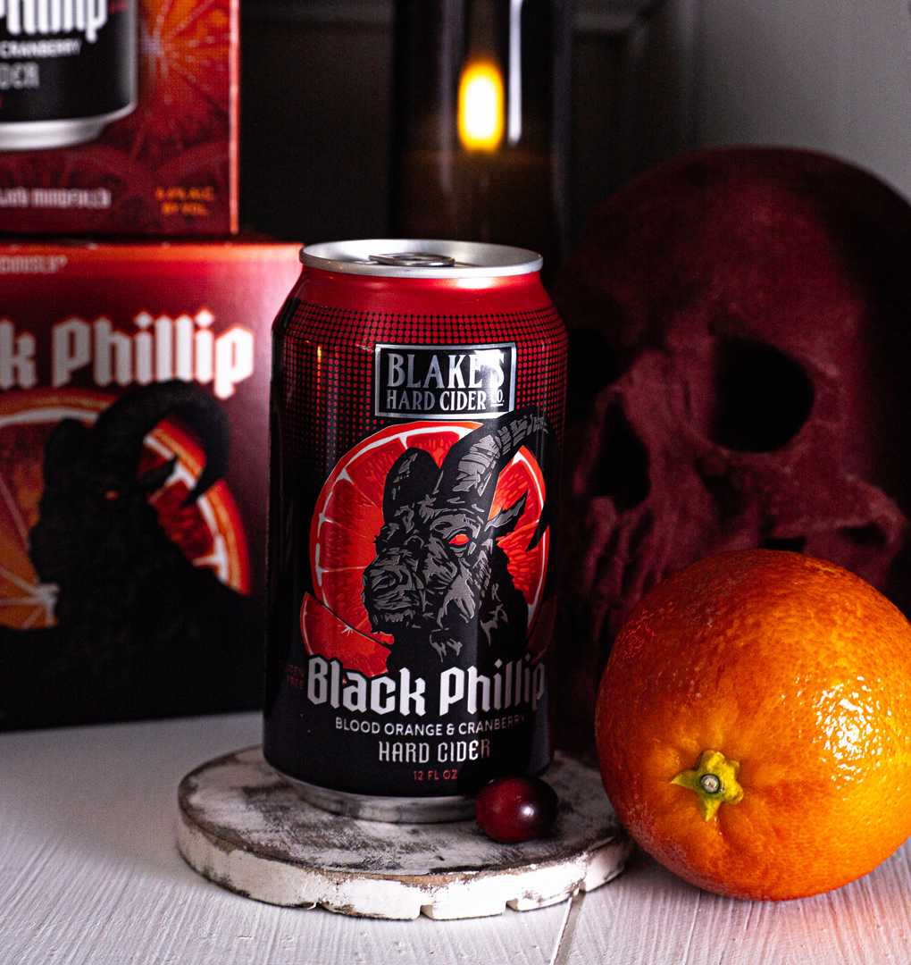
Give Phillip a dignified ¾ portrait makeover and pump up the volume on taste with bold reds and oranges in hand illustrated blood orange slices.
-
Reignited consumer interest and positioned as a core SKU for 2026
The redesign in 2023, and the subsequent refresh in 2024, brought this cider back out of the archive after being retired. Now, in 2026, we are looking at the next evolution of Black Phillip, proving great liquid can stand the test of time as long as the vessel continue to inspire new and current fans.

BLACK PHILLIP REFRESH
BLACK PHILLIP REFRESH


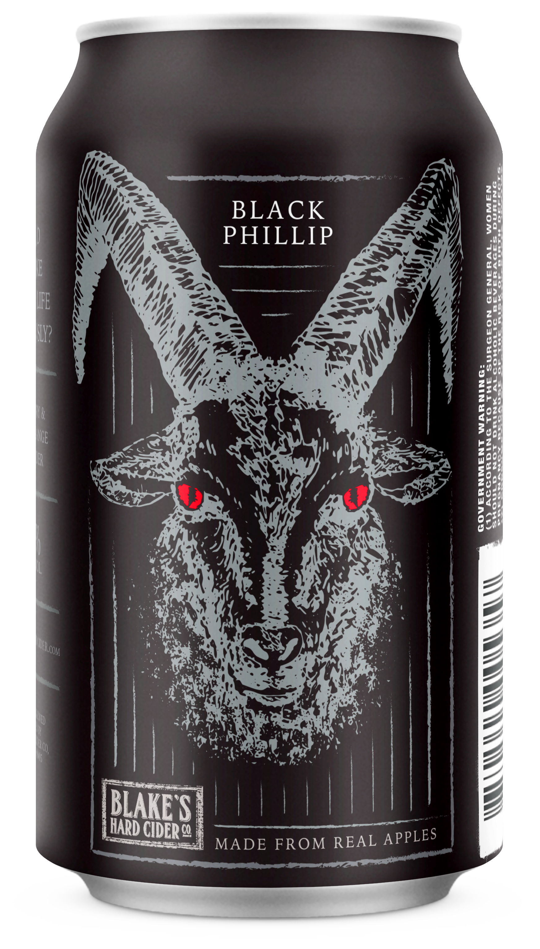
2016

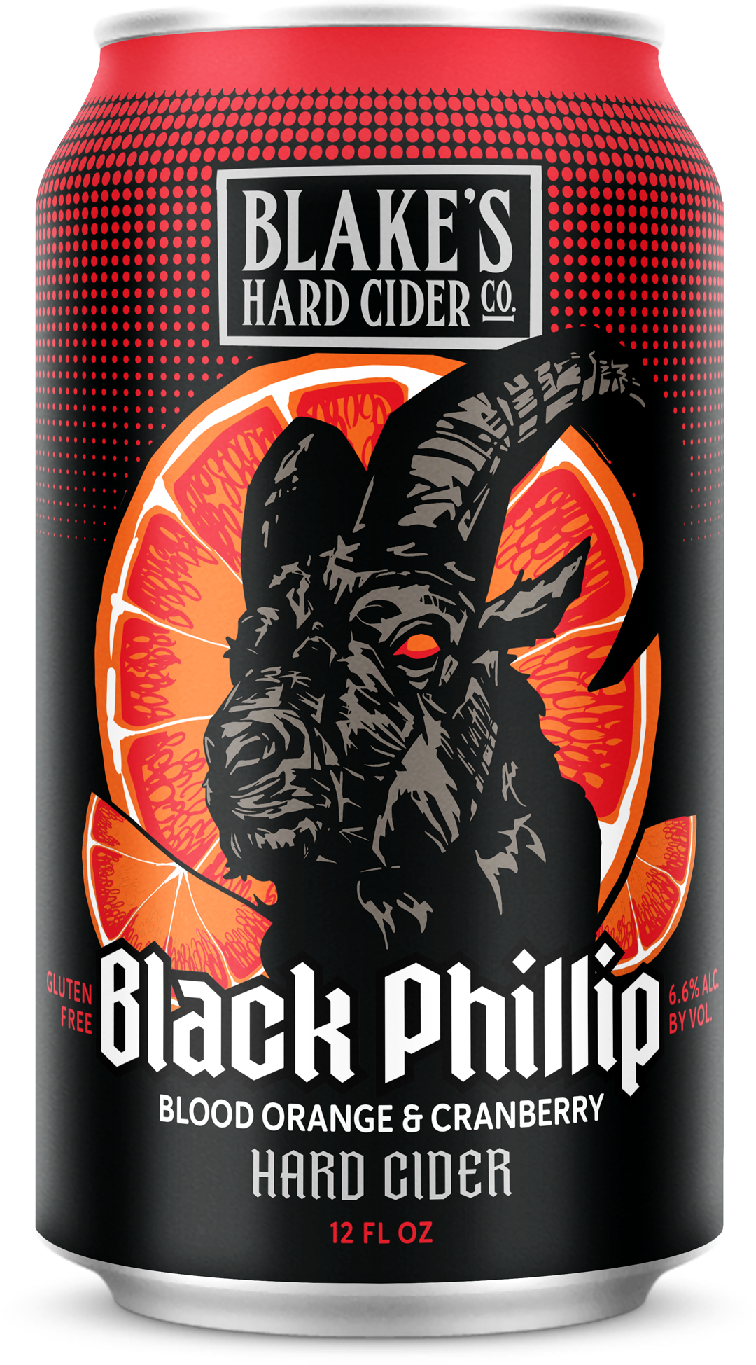
2023/2024
2026 Edition: Coming Soon!


Client: Blake’s Hard Cider Co.
Creative Direction - Salina Matthews, Danny Jacobs
Set Design - Salina Matthews
Illustration - Salina Matthews
Package Design - Salina Matthews, OkYellow
Photography - Alex Paolella, Adam Yarbrough, Brandon Bailey, Rachel Smalley
Cocktail Styling - Kevin Devries, Salina Matthews
Original Black Phillip Packaging Design - Adam Yarbrough